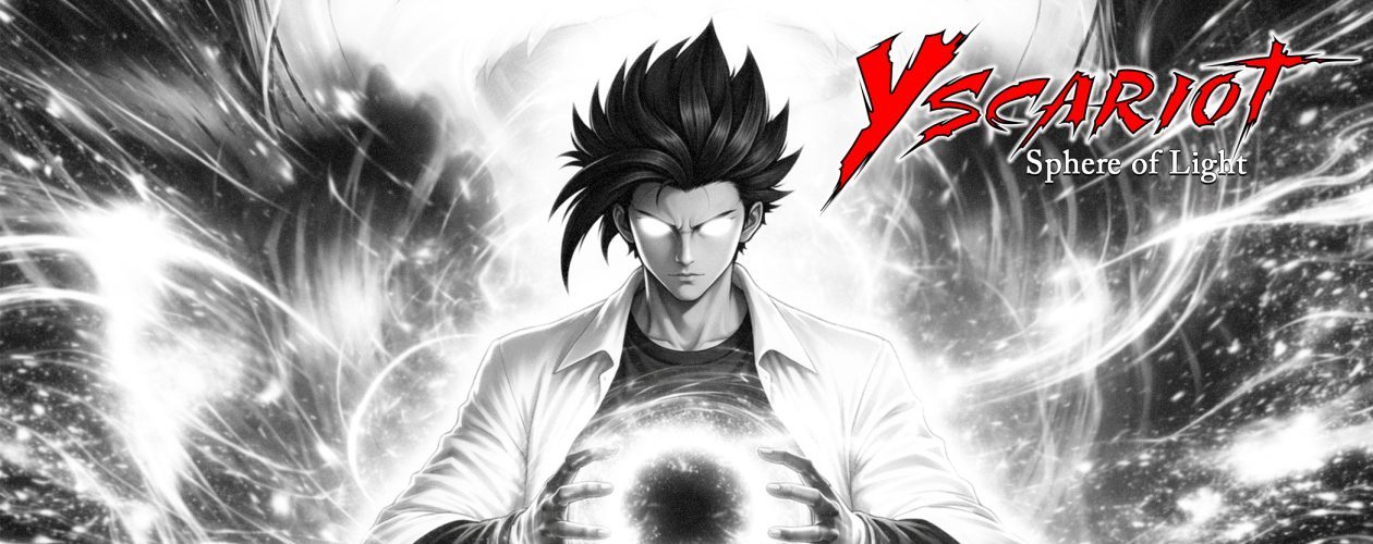
![]() Hello everyone! It is me again with some fun news. Just now, I put together a new logo for X’el Studios in time for the next year. The 2016 logo will replace the X’el Ribbon that was branded on previous works and concepts. I will talk about the previous designs as I progress in time with my works.
Hello everyone! It is me again with some fun news. Just now, I put together a new logo for X’el Studios in time for the next year. The 2016 logo will replace the X’el Ribbon that was branded on previous works and concepts. I will talk about the previous designs as I progress in time with my works.
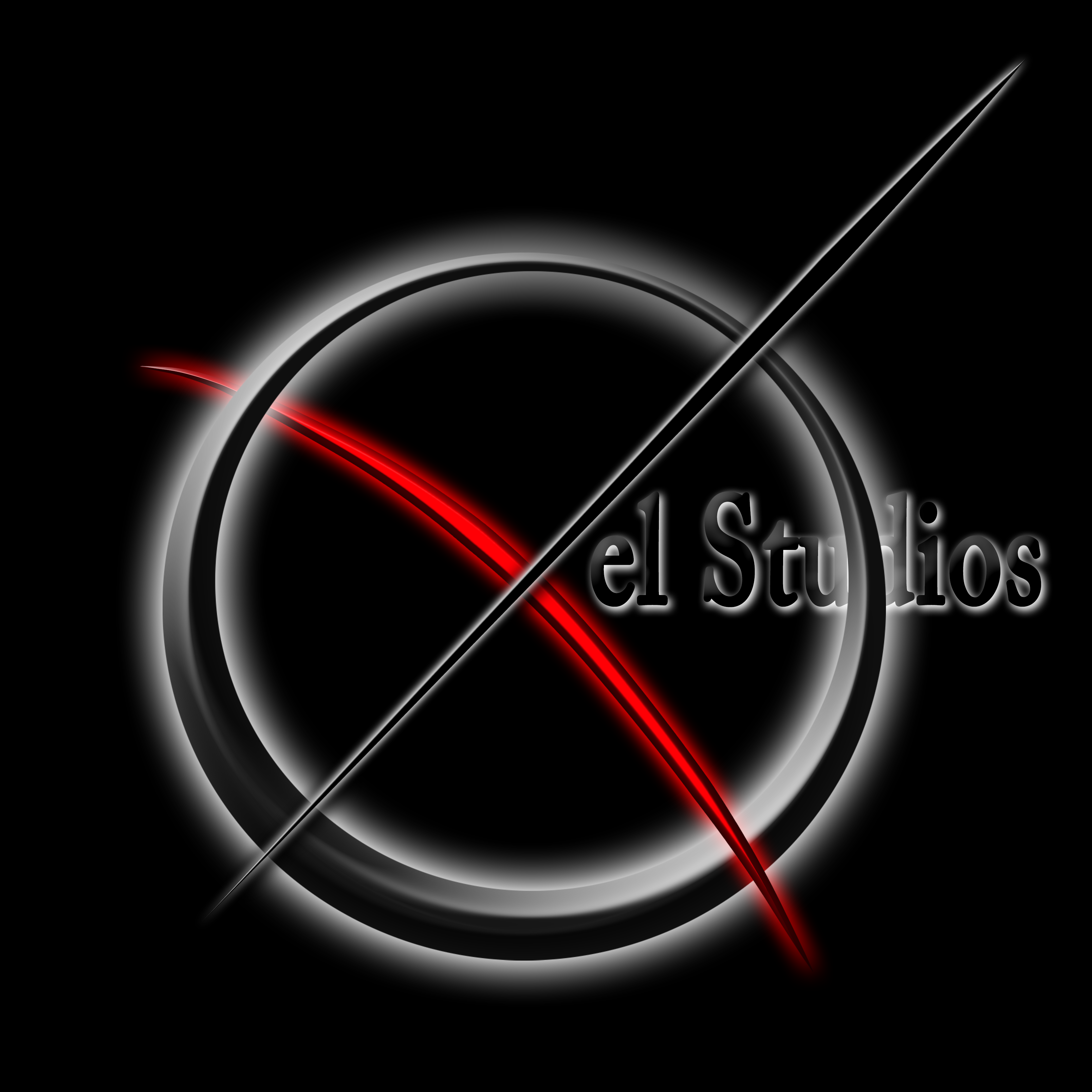
About my logo:
As you might have already known, X’el means “Excel”, or to be extremely great at something. The concept of this new design was inspired by the original 2-dimensional X’el Comics logo that I created in 2012 which featured a red “X” and a black ring. The second logo, or X-Ribbon design, replaced the original black ring, but was wrapped in a circular shape to keep in line with the concept of the 2-3 parts of the logo.
Originally, I looked to create an “X” that resembled a fencing blade but went for the arrow concept. Since it is a Saturday, I did not feel like getting my pen and tablet to go for a precise sword design, and I also feel that swords are a bit overused now days in logos. Anyways, the red bow is the foundation of ideas. The black arrow points up and forward and symbolizes progression of ideas. The ring symbolizes the “all” of the known and the unknown. In other words, everything in your circle is what you know, and everything else outside can be brought into the circle.
The colors, red and black, are my personal favorites and you will see that on all of the logos so far. To me, they express a level of seriousness that I usually don’t get the chance to express in person. You can say that I am the goofy and relaxed kind of man when it comes to living life. To me, red is “the life” and black is “pure power”.
I think it took me about a good hour to put this all together even with weeks of of envisioning this sort of thing in my head.
I better get something to eat now… it is getting late.